
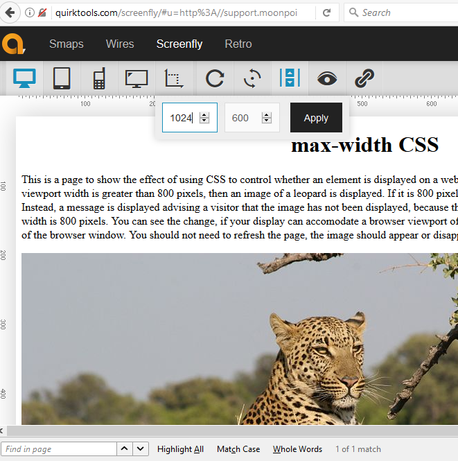
There may be times when you don't want an element on a webpage, e.g., an image or ad, displayed to a visitor, if his or her browser width isn't sufficiently wide to display the element without making the rest of the page hard to read or disrupting the aesthetics of the page. This is a page to show the effect of using CSS to control whether an element is displayed on a web page based on the size of the browser's viewport. If the viewport width is greater than 800 pixels, then an image of a leopard is displayed. If it is 800 pixels or less in width, then the image is not displayed. Instead, a message is displayed advising a visitor that the image has not been displayed, because the browser viewport is insufficently wide. The image width is 800 pixels. You can see the change, if your display can accomodate a browser viewport of at lest 800 pixels by shrinking or expanding the width of the browser window. You should not need to refresh the page, the image should appear or disappear as you adjust the browser window width.

No leopard for you. Your browser viewport is not wide enough.
The third specification of the Cascading Style Sheets (CSS) style sheet language, CSS 3 provides support for media queries, which can adjust the display of information in a browser based on screen resolution, e.g. smartphone screen vs. computer screen, the width of the browser viewport, etc. This is done through the use of "@media, which can be used in a style sheet or a style element included in the <head> section of the HTML code.
Two parameters that can be used with @media are shown below:
| max-width | The maximum width of the display area, such as a browser window |
| min-width | The minimum width of the display area, such as a browser window |
In the head section of the HTML code for this page, I have the following style information:
@media screen and (max-width: 800px) { .hideImage { display: none; } }
@media screen and (min-width: 801px) { .tellVisitor { display: none; } }
For the image, I have the following code:
For the text message, I have the code below:
If you wish to test how a webpage is displayed when the browser window width is a specific value, you can use Screenfly. You can put a URL in the field where you see "http://". When you click on Go, you will see the page displayed at your browser's current settings. You can then click on any of the icons above the webpage, to select the dimensions for common devices, such as desktop, tablet, mobile, or TV. To the right of the icon for TV, you will see an icon that shows a vertical line and a horizontal line with a dotted line linking them. Click on that icon to specify a specific width and height in pixels.
Related articles:

