←July→
| Sun |
Mon |
Tue |
Wed |
Thu |
Fri |
Sat |
| |
|
|
1 |
2 |
3 |
4 |
| 5 |
6 |
7 |
8 |
9 |
10 |
11 |
| 12 |
13 |
14 |
15 |
16 |
17 |
18 |
| 19 |
20 |
21 |
22 |
23 |
24 |
25 |
| 26 |
27 |
28 |
29 |
30 |
31 |
|
|
|
Sat, Oct 05, 2024 10:51 pm
Resizing an image with CSS
If you want to resize an image on a webpage, e.g., to have it display as
a smaller image on a webpage than it would based on the image's dimensions,
you can edit the image with a graphics editing application to create
a smaller version of the image or you can use
Cascading Stylesheets
(CSS). If you wished to apply the reduction in size to just one image
on the page, you could apply a style directly to the IMG tag for that
image. E.g., if
image1 is
663 pixels wide by 307 pixels high, and you wanted to have the image
displayed as 75% of that size, you could use <img src="image1.jpg"
alt="Image 1" style="transform: scale(0.75)"> to have it display as
an image 75% of the actual dimensions of the image. E.g.:
Image 1 at full scale
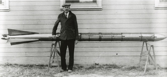
Image 1 at 75% scale
Note: The image above is a photo of
Robert H. Goddard
with an A-series rocket circa 1935
Related articles:
Automatically resizing an image for mobile devices
[/network/web/html/css]
permanent link
Thu, Mar 07, 2024 11:56 pm
Table Attributes Deprecated in HTML 5
In
HTML 4, you could
use
<table width="100%">.
In
HTML 5, using width in
that way has been deprecated in favor of putting the width within a style
designation. If you use
<table width="100%"> in an HTML 5
webpage and check the page with the
W3C
HTML validation tool, you will see the message
"
Error The width attribute
on the table element is obsolete. Use CSS instead." You can use the following,
instead:
<table style="width: 100%;">
The same is true for specification of the width of <td>
table elements. Under HTML 4, the following was ok:
<td width="33%" align="left">
In the above HTML code, the cell width could be specified as 33% of the
table width and text in a cell could be left-aligned with
align="left". Under HTML 5, though, both specifications are
considered obsolete and the following should be used, instead:
<td style="width:33%; text-align:left;">
If you need to center the text, you can use text-align:center,
instead. If you wish to vertically align an element in a table cell, such
as text or an image, in HTML 4 you could use the following:
<td valign="top">March 12</td>
In HTML 5, you can use the following instead of the above deprecated use of
valign:
<td style="vertical-align: top;">March 12</td>
[ More Info ]
[/network/web/html/css]
permanent link
Wed, Nov 17, 2021 9:56 pm
Automatically resizing an image for mobile devices
I created this domain in April of 1997, a time when mobile device usage was
not common.
HTML 3
was the version of the HyperText Markup Lanugage (HTML) in usage then with
HTML 4.0 not being
pubished as a W3C Recommendation until December of that year. In the past,
I used to add material to the site far more frequently. I haven't added much
to the site in the last few years and haven't made any significant changes
to the site for many years. Consequently, visitors viewing pages with large
images from a mobile device would see only the leftmost portion of those
images and would need to scroll right if they were using a mobile device
such as a phone. I finally added a few lines to the site's style.css
Cascading Style Sheets (CSS)
file today to have images be scaled down to fit the screens of mobile devices.
The lines I added are those below:
img {
  max-width: 100%;
  height: auto;
}
Those lines tell browsers that the maximum width of an image when it is
displayed within the user's browser shoud be no wider than the page's
width as it is displayed within that browser on that device. I added the
"height: auto;" to ensure that when images are resized that the height
is also adjusted to maintain the height to width ration of the original
image. Otherwise, some images might be distorted so that the image height
would be much greater in relation to its width than in the original
image. With the auto setting, the height to width balance remains such that
the image fits within the displayed page without appearing elongated.
[/network/web/html/css]
permanent link
Sat, Apr 10, 2021 5:26 pm
Creating a list that is expandable and collapsible in HTML5
If you wish to make a list that can be collapsed and expanded on a webpage
or a section on the page that can be expanded to reveal more details,
you can use the
details and
summary tags with
version
5 of HTML. E.g., the following code allows information to be displayed or
hidden by clicking on an arrowhead that will appear to the left of whatever
appears within the
summary tags. The information within the
details tag will be hidden or displayed by clicking on the
arrowhead to toggle between the two options.
<details>
<summary>Overview</summary>
The American Civil War began on April 12, 1865 when South Carolina
militia forces attacked Fort Sumter at Charleston, South Carolina.
The war effectively ended on April 9, 1865 with the surrender by
Confederate General Robert E. Lee to Union General Ulysses S. Grant, but
the president of the Confederacy, Jefferson Davis, did not declare an
end to the insurrection until May 9, 1865. Each side in the
conflict suffered over 800,000 casualties. The principal cause of the
conflict was the issue of slavery within the United States with abolitionists
in the North viewing the practice as a crime against humanity while Southern
slave owners viewed it as a necessary evil or, for some defenders of slavery,
even as a positive good, which they feared would be eliminated under the
recently elected President Abraham Lincoln.
</details>
[More Info]
[/network/web/html]
permanent link
Sun, May 27, 2018 9:13 pm
Centering divs with flex-container
With
HTML 4, centering the contents within a
div is simple. You
just use <div align="center">. E.g., if I wanted to
center the image and text below on a webpage, I could use the following
code:
<div align="center">
<img src="186px-Antinous_Mandragone_profil.jpg" alt="Antinous Mangragone
profile"><br>
<a href="https://commons.wikimedia.org/wiki/File:Antinous_Mandragone_profil.jpg">
Antinous Mandragone</a>
</div>
The image would then be displayed in browsers as seen below:
[ More Info ]
[/network/web/html/css]
permanent link
Sun, Feb 18, 2018 10:10 pm
Displaying a tooltip
A tooltip, aka infotip or hint, is a small box of text
that appears when a user hovers the mouse pointer over an item, such as a
particular word or phrase, on a webpage. If you wish to display a
tooltip when a user hovers the mouse pointer over text on a webpage,
there are a number of ways you can do so. The simplest way to do so
is to specify a title attribute, which is an
HTML global attribute with the
span tag. E.g.:
<span title="This is the tooltip text to be displayed when the mouse is
hovered over the spanned text.">example text</span>
This is an example using the above technique with example text.
[ More Info ]
[/network/web/html]
permanent link
Mon, Jun 19, 2017 9:39 pm
Wrapping text on a webpage
I query an
SQLite database using PHP code on a webpage. One of the fields in the database
is a "Note" field, where notes have been entered without any HTML code to
format the text. When I display the notes on a webpage, I want to preserve
the line breaks and paragraphs as they were typed. Since there are no
<br> line break nor <p> paragraph tags on
the page, I could display the text as typed using the
pre tag, but the
problem with just using that tag is that in cases where the a line is very
long, someone would have to scroll far to the right to see the entire line
on the webpage, if I just used the pre tag. However, I can specify a style
for the pre tag that will result in the text wrapping at the right-edge of
the browser window. E.g. <pre style="white-space: pre-wrap">
. Or, if I don't want the text displayed in the monospaced default
font for the pre tag, I can apply the style to the
<div> tag,
instead. E.g.: <div style="white-space: pre-wrap">.
[ More Info ]
[/network/web/html]
permanent link
Sun, May 07, 2017 6:09 pm
Centering an image on a webpage horizontally
To center an image horizontally on a webpage, you can add
style="display: block; margin: auto;" to the
img tag. E.g.
<p>
<img src="320px-Fisher_500_radio.jpg" alt="Fisher AM/FM radio from 1959"
width="320" height="208" style="display: block; margin: auto;">
</p>

Related articles:
-
Centering a div and an image within it using CSS
[/network/web/html/css]
permanent link
Sat, Apr 22, 2017 11:20 pm
Vertically aligning an image with text using CSS
If you wish to vertically align an image with text in
Hypertext
Markup Language (HTML) code that is compliant with
Cascading
Style Sheets (CSS) you can do so using <style="vertical-align:
position;"> where position is bottom, middle, or top.
E.g., if I want to align an image of the
direct current
symbol, which is a horizontal line over top of three shorter horizontal lines,
so that the image is vertically in the middle of the text, I could use the code
below:
24V <img src="direct-current.gif" width="49" height="49"
style="border: none; vertical-align: middle;" alt="Direct current symbol">1500mA
I would then see the following:
24V 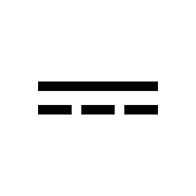 1500mA
If I used vertical-align: top, instead, the image would
appear as shown below where the text is aligned with the top of the
image:
24V 1500mA
If I used vertical-align: bottom, instead, the image would
appear as shown below:
24V 1500mA
If I did not specify a vertical alignment, the image would appear as
it did when I specified "bottom" for the vertical alignment as shown
below:
24V 1500mA
Though, in this case I could also have used the HTML code
⎓, instead, for the direct current symbol and avoided the
use of an image and the need to align the image with the text, though I
didn't realize that when I started using the image on a page for
power adapter for various devices.
E.g.: 24V ⎓ 1500mA
[/network/web/html/css]
permanent link
Sat, Mar 04, 2017 10:00 pm
CSS max-width and min-width for @media
The third specification of the
Cascading Style
Sheets (CSS) style sheet language,
CSS 3 provides support for
media queries, which
can adjust the display of information in a browser based on
screen resolution, e.g. smartphone screen vs. computer screen, the width
of the browser
viewport, etc. This is done through the use of
"
@media,
which can be used in a style sheet or a style element included in the
<head> section of the
HTML code.
Two parameters that can be used with @media are shown below:
| max-width | The maximum width of the
display area, such as a browser window |
| min-width | The minimum width of the
display area, such as a browser window |
[ More Info ]
[/network/web/html/css]
permanent link

Privacy Policy
Contact


